Killing the Reporting Spreadsheet
If you’ve worked at a marketing agency, you know the spreadsheet I’m talking about. Every agency has one. It’s enormous and held together by Supermetrics connectors, a decade of accumulated formulas, and the institutional memory of whoever built it. That person may or may not still work there.
One of ours tracked ad spend for a client whose billing runs on purchase orders. Not “send an invoice at month end” billing, but procurement billing where every dollar of ad spend draws down against a specific PO with a specific balance. When a PO runs dry, the campaigns it funds have no money behind them until we receive a new PO. The spreadsheet’s job was to answer, at any moment: how much has each PO burned, how much is left, and how long until it’s gone?
It answered those questions the way a spreadsheet answers anything: slowly, fragilely, and only if a human remembered to check. Supermetrics refreshes failed silently, formulas broke when someone inserted a row, and reconciliation was a monthly manual ritual. The scariest part for me was that nobody fully trusted the numbers, including the people maintaining them.
At some point the spreadsheet stopped being the report and became the risk, so I decided to kill it.
Warehouse, not a better spreadsheet
The tempting fix is a cleaner spreadsheet with smarter formulas, more discipline, and a locked template. Unfortunately, or maybe fortunately, I’ve made that mistake before. The cleaner spreadsheet degrades into the old spreadsheet in about two quarters, because the problem was never the formulas. The problem was that a spreadsheet is simultaneously the database, the transformation layer, the reporting layer, and the UI, and every one of those jobs corrupts the others.
The actual fix is a real data warehouse, with each layer doing one job.
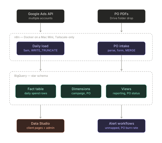
The design is a small star schema in BigQuery. One fact table holds daily spend: one row per campaign per day, pulled fresh from the ad platform. Dimension tables hold the stuff that describes the spend: campaign metadata (which business unit, which region, which team) and the POs themselves (number, value, status). Views join it all together: a reporting view for dashboards, a reconciliation view for billing, a PO status view that computes burn rates and time-to-exhaustion.
Dimensional modeling is relatively new to me, but the idea is simple: facts are things that happened (we spent $X on campaign Y on date Z), dimensions are things that describe them (campaign Y belongs to business unit A and draws from PO B). You keep them separate, join them in views, and suddenly questions that took an afternoon of spreadsheet mashing become one query.
This is also the layer where I’ll admit the plan and the build diverged. My self-teaching roadmap said SQL fundamentals first, then a project. What actually happened is the project arrived with a deadline and I built this ship while I was sailing it. I’ve always loved doing that.
The pipeline
The workflows live in n8n, which is self-hosted in Docker on the same Mac Mini that runs my library. Everything stays off the public internet.
Every morning at 5am, a workflow pulls the previous day’s spend from multiple Google Ads accounts via the API’s searchStream endpoint, then loads it into BigQuery with a service account. The load is WRITE_TRUNCATE. That wipes and replaces the whole table, which sounds aggressive but is the point. The load is idempotent: run it once or run it five times, you end up in the same state. No duplicate rows, no “did yesterday’s load finish?” anxiety. For a table this size, rebuilding from source daily is cheaper than trying to be too clever.
That principle, every operation safe to re-run, turned out to be the most important design decision in the whole build. Anything that mutates data does it as DELETE-then-INSERT or a proper MERGE, never INSERT-on-top. When something eventually goes wrong (see Murphy’s Law), the fix is “run it again,” not “figure out which rows are duplicates.”
The guardrails
This is the part I’m most excited about: the system polices its own data quality, so a human doesn’t have to remember to.
A warehouse is only as good as its dimensions. New campaigns appear in the ad accounts constantly, and a campaign the dimension table doesn’t know about is a campaign whose spend can’t be attributed to a business unit or a PO. In the spreadsheet era, unmapped spend just silently vanished into the wrong bucket until someone noticed at reconciliation time.
Now, the daily load ends with a check: any campaign in the fact table that isn’t in the dimension table triggers a Slack message to the account manager who owns the mapping. It’s formatted as a fill-in-the-blanks request, so responding takes two minutes. The gap between “new campaign exists” and “new campaign is mapped” went from weeks to hours, and nobody has to go looking.
The second guardrail watches the money. A weekly workflow queries the PO status view and computes burn rates: how fast is each PO drawing down, and at the current pace, how many weeks until it’s exhausted? Anything overdrawn, or within a week of running out, lands in Slack. The alert that used to be “a human happened to look at the spreadsheet at the right moment” is now just a query on a schedule.
The third one is my favorite. New POs arrive as PDF documents. The old process was: a human reads the PDF, types the number and value into the spreadsheet, hopefully correctly. The new process: drop the PDF in a designated Drive folder. A workflow picks it up, parses out the PO number and value with a Python PDF parser (the documents follow a consistent enough layout that anchoring on a couple of regex patterns covers nearly all of them), posts a confirmation form to Slack for a human to sanity-check, renames the file, and MERGEs the record into the PO dimension. The human is still in the loop, but as a reviewer, not a typist.
None of these three is impressive alone. Together they’re the difference between a system you check and a system that tells you.
The dashboard layer
On top of the reporting view sits Looker Data Studio: several client-facing pages filtered by business unit, goal, team, and PO, plus an internal admin page. The warehouse does the thinking; the dashboard just shows it.
Two decisions here are key.
First, filter placement. Client-facing pages should only show mapped, attributable spend; unmapped campaigns are an internal problem, not a client-facing number. That filter has to live at the page level. Put it at the report level and it poisons your internal admin page, which exists precisely to show the unmapped stuff. Put it on individual charts and you will, guaranteed, miss a tile someday. Page-level is the only placement that fails safe.
Second, data fixes belong in the warehouse, not the dashboard. When a campaign label is wrong, the tempting fix is a calculated field in Data Studio. Fix the dimension table instead. Every view, every report, every future query inherits the fix. The dashboard should be the dumbest layer in the stack.
The dish and the recipe
The lesson that cost me the most time is embarrassingly simple in hindsight.
I kept the SQL that builds each dimension table in version-controlled files. Responsible, right? The problem is that live tables drift. I’d fix a label with a quick UPDATE, the PO intake pipeline would MERGE in new records, and within a few weeks the live table and the .sql file that supposedly builds it were two different things. Re-run that file and it quietly reverts every fix made since.
The mental model that stuck: the live table is the dish, the .sql file is the recipe. Season the dish directly and the recipe goes stale. Cook from the stale recipe and you wipe out the seasoning.
Discipline won’t fix this. Nobody updates the recipe at 4:55 on a Tuesday. So I automated it: a query that reads the live table and writes out the exact INSERT statements to rebuild it as it stands today. Touch a table directly, run the regeneration query, commit the output. The file stays honest because it’s generated, not maintained.
A few smaller ones, for whoever’s Googling at 11pm:
- BigQuery’s
jobs.queryAPI returnstotalRowsas a quoted string, not a number. Coerce it before you compare it to anything, or enjoy debugging why"2" > 10behaves strangely in JavaScript. - Row data in the API response is positional, buried under
rows[].f[].v. There are no column names down there. Bring a map. rowsis a reserved word in BigQuery and can’t be an unquoted column alias.- Docker compose YAML belongs to whichever service it’s indented under. A volume mount indented under the wrong service isn’t an error, it’s silently ignored, which is worse.
What it replaced
Before: hours of manual reconciliation every month, a refresh chain that failed silently, PO balances that were only as current as the last time someone checked, and a spreadsheet everyone was afraid to touch.
After: a daily automated load, dimensions that flag their own gaps, PO burn alerts on a schedule, PDF intake that types for itself, and dashboards reading from one governed view. The monthly reconciliation ritual became a query. The spreadsheet is a read-only relic.
The bigger thing I took from this build isn’t any single technique, it’s that the gap between “marketer who uses data tools” and “marketer who builds data systems” is smaller than it looks. The concepts (facts, dimensions, idempotency, views) are a weekend of reading. The fluency comes from building something real, with real stakes, that real people depend on and then writing down what broke and how to fix it.
Somewhere at your company there’s a spreadsheet that stopped being the report and became the risk. You already know which one. Go kill it.